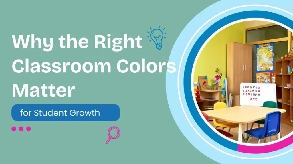
Why the Right Classroom Colors Matter for Student Growth comes down to something very simple: young children can’t turn the room off. Their brains are still learning to filter information, so walls, floors, classroom colors, furniture, toys, and posters are all “on” at the same time. A palette that’s calm and coordinated helps them focus longer, feel safer, and manage emotions with less effort. A palette that’s loud and chaotic pulls attention away from learning and keeps their nervous systems slightly over-worked, even on a good day. The room becomes either a quiet assistant to growth or a constant distraction from it.
For a daycare or preschool leader, that’s not just a design preference; it’s an operational issue. The same group of children in the same curriculum will behave differently in two differently colored rooms. Softer base tones and thoughtful classroom colors support self-regulation, smoother transitions, and more settled play, which means fewer behavior flare-ups and less stress for staff. Parents feel it as well the moment they walk in. A space that looks intentional and gentle builds trust in your program in a way marketing copy never quite can.
This article will focus closely on this reality. It explores how classroom colors affect learning, emotions, and behavior, and then delves into practical considerations: which colors are best suited for early childhood classrooms, how to combine colors to avoid visual clutter, what factors to consider before making any changes, and how to transform the space using furniture, storage facilities, carpets, and various materials instead of undertaking large-scale architectural renovations. Our goal is not to create a flawless model classroom, but to help you make informed decisions that will make your classroom a powerful tool for you and your teachers in your daily teaching work.
Importance of Classroom Colors
For most of the day, children don’t consciously notice the color of the walls or the lockers. However, their nervous systems are still perceiving these colors. A growing body of research shows that color can affect a person’s level of arousal, heart rate, and attention span, even if they are not consciously aware of the colors around them.

Because their self-regulation skills are still developing, the environment often plays a greater role in helping them regulate their behavior. This is why you might sometimes see a classroom where everyone seems anxious and restless for no apparent reason, or another classroom where children are able to engage in activities more quickly without constant teacher intervention. Of course, color isn’t the only influencing factor, but compared to staffing or curriculum design, it’s one of the few factors that can be adjusted relatively easily.
If a room is already filled with toys, posters, and learning materials, adding very bright walls and furniture on top of that often leads to visual overload. Children will exhibit more activity, more talking, and more distractions.
On the other hand, a room dominated by soft tones with a few bright accents, even with the same activities and materials, won’t feel overwhelming. Teachers can have a space that promotes focus rather than one that hinders it.
Using Color Psychology
Color psychology might sound like a buzzword, but the reality is far more complex, especially when it comes to children. However, some patterns consistently emerge across different studies and practical classroom settings, making them very helpful for lesson planning.
Soft, cool tones have repeatedly been shown to be associated with calmness, focus, and reduced anxiety. In early childhood classrooms, these tones are ideal for areas where children need to settle down: reading corners, group activity areas, nap areas, or any place where emotional fluctuations frequently occur. Warm colors generally evoke feelings of energy, optimism, and sociability. They help promote communication and engagement.
Red is a powerful color. It attracts attention and can increase heart rate and excitement. This is why it’s used in warning signs, stop signs, and promotional tags. In a preschool classroom, using too much red over large areas can lead to restlessness and conflict among children.
One aspect of color psychology that is sometimes overlooked is the use of neutral spaces. White, soft grays, beige, and natural wood tones act as pauses between saturated hues. They allow the eyes and brain to rest, making purposeful color accents more effective.
This balance is especially important in early childhood classrooms. If everything is brightly colored, nothing stands out, and the environment becomes a large, overwhelming block of stimulation—and that’s where the real application of color psychology in classroom teaching comes in.
Classroom Colors Make a Difference
Once you start watching for it, you see how often the room itself joins the lesson. The tone of the walls, the color of the tables, even the storage bins quietly suggest what kind of day this will be. In early childhood settings, classroom colors are not neutral; they nudge how long a child can stay with a task, how safe they feel to try something new, and how quickly the group tips from calm to noisy. The effects are subtle, but over months and years, they add up.
The Impact of Classroom Colors on Learning
When teachers say children are “easily distracted” while learning, it’s often not just because of toys. Overly bright colors in the classroom can keep the brain constantly working in the background, distracting children from books, puzzles, or the teacher. Softer, muted tones make learning materials stand out visually, guiding children’s attention to where you want them to focus. Over time, this means children can expend less energy filtering out their environment, leaving more energy for memory, language, and problem-solving. The learning content hasn’t changed, but the classroom environment is no longer competing with the learning material for the child’s attention.
The Impact of Classroom Colors on Children’s Behavior
Behavior is usually treated as a child issue or a teacher issue, yet the room keeps voting in every interaction. Very intense classroom colors can push children toward impulsive choices: running instead of walking, grabbing instead of asking, shouting instead of calling a teacher. Calmer palettes, clear color zoning, and limited accents tend to support more self-control. Children read the space as predictable and safe, which makes it easier for them to follow routines and listen to directions.
The Impact of Classroom Colors on Emotions
Young children often experience feelings before they develop understanding. They enter a room, and their bodies react before they can even express their feelings. The colors of a classroom can either soothe or intensify these initial emotional responses. Soft tones and natural colors suggest a safe and stable space that won’t overwhelm them. Extensive use of very bright or highly contrasting colors can make sensitive children more anxious or withdrawn, while others may become overexcited.
The Best Classroom Colors
Choosing the best classroom colors isn’t about finding the perfect color scheme on Pinterest. It’s more important to select practical shades that suit young children, the teaching staff, and the atmosphere you want to create in the classroom. Each primary color has its unique effect, and often works better as an accent color than as a dominant one. The key is to consider base colors, accent colors, and highlight colors, rather than having a cacophony of bright colors competing for attention.
Blue
Blue tends to calm the room down a little. Not a dark, moody navy everywhere, but softer sky or dusty blue shades on walls, rugs, or storage. It helps with focus and makes loud materials feel quieter.
Suggested uses for blue:
- Wall color in reading or circle-time areas
- Soft furnishings: rugs, cushions, curtains
- Chair legs, table edges, or storage bins as subtle accents
- Background for visual schedules or calm-down corners
- Larger furniture surfaces where you want a steady, quiet feel

Green
Green feels steady and natural, especially in tones that resemble plants or leaves rather than neon markers. It bridges calm and alert nicely, which makes it good for mixed-use spaces.
Suggested uses for green:
- Cozy reading corners or nature-themed areas
- Storage units or cubbies near the entrance to soften transitions
- Tabletops or seating in project zones where children work together
- Indoor “nature” displays or science corners
- Soft play mats that visually ground the floor

Yellow
Yellow brings light and optimism, but it gets tiring quickly if every surface is bright. It works best in small doses where you want a bit of lift without turning the whole room into a highlighter.
Suggested uses for yellow:
- Accent walls or partial sections near creative areas
- Chair seats, art carts, or supply trays
- Labels, signage, and borders on bulletin boards
- Light fixtures or lampshades that warm up the space
- Small decorative elements that draw the eye without shouting

Red
Red is strong. It grabs attention fast and keeps energy high. That can be useful in very controlled spots, but not as a default choice for big surfaces in early childhood classrooms.
Suggested uses for red:
- Small accents on safety signs or boundary markers
- Limited seating in high-energy areas like gross motor corners
- Game pieces or manipulatives that need to stand out
- Visual cues for “stop” or “wait” in routines
- Tiny elements in art displays, balanced with cooler tones nearby

Orange
Orange feels friendly and social, somewhere between yellow’s brightness and red’s intensity. Softer, more muted oranges tend to work better with young children than neon tones.
Suggested uses for orange:
- Soft accents in group work or snack areas
- Storage baskets for shared materials
- Details on rugs or wall decals to warm up cooler palettes
- Portions of play kitchen, pretend play furniture, or block areas
- Seasonal displays that add warmth without overwhelming the room

How to Mix and Match Classroom Colors
Choosing individual shades is the easy part. The harder piece is how they actually live together in one room filled with tiny chairs, artwork, and plastic toys in every possible hue. A single beautiful paint color can still fail if everything around it is shouting at the same volume. When you think about mixing classroom colors, it helps to zoom out from swatches and imagine the whole day: where the eye should rest, where energy should rise, and where it needs to drop.
The 60-30-10 classroom color rule for daycare centers
The 60-30-10 idea comes from interior design, but it fits early childhood rooms surprisingly well. Roughly sixty percent of the visual field belongs to your base color: walls, large cabinets, big furniture frames. This is what sets the emotional tone. If that base is soft and calm, the room has more flexibility. If the base is loud, everything else you add becomes harder to control.
The thirty percent band covers supporting tones. These usually show up in rugs, tables, smaller shelves, window treatments, and some storage. In classroom colors this is where you can lean into gentle blues, greens, or warm neutrals that play nicely with your base and help define zones. The supporting colors should feel like they belong to the same family, not like a separate theme layered on top.
The final ten percent is where you let stronger accents speak. This can be the slice for bolder yellows, oranges, or a very controlled use of red. Think trims, a few chairs, bins, and parts of displays. That ten percent is often what children notice first, so it works best when it’s intentional: marking activity areas, highlighting important visuals, or adding small bursts of joy rather than covering every free surface.
Matching wall colors with preschool furniture and flooring
Walls get most of the attention when people talk about paint, but in a preschool room the furniture and flooring often carry just as much visual weight. If you choose a beautiful wall tone and then bring in twenty bright primary-colored chairs, the chairs win. It helps to treat walls, major furniture pieces, and the floor as one large canvas when you think through your classroom colors.
A simple way to start is to decide which element will do the “talking” and which elements will stay quieter. If your floor is already busy with strong patterns or saturated tones, it usually makes sense to keep walls neutral and choose furniture in softer, related shades. If the floor is calm and simple, you have more space to let furniture introduce gentle color, while walls provide a steady backdrop.
Existing finishes are also a real constraint for many centers. You may not be changing the flooring this decade, and budgets might limit furniture updates. In that case, wall color becomes the tool that ties everything together. Picking a wall tone that echoes a softer color already present in flooring or furniture can make an older room feel intentional rather than accidental. The goal isn’t to erase every mismatch, but to give the overall palette a sense of calm direction.
Factors to Consider When Choosing Classroom Colors
When you strip away the paint charts and Pinterest boards, choosing classroom colors is really a risk–management problem. The environment can quietly push learning up or down for years, and you only renovate every so often. Large studies, like the University of Salford’s Clever Classrooms study on classroom design and learning, suggest that physical design factors such as light, color, and layout together can account for more than 10–20% of the variation in academic progress for young children.
So before locking in a palette, it helps to slow down and walk through the real conditions in your rooms: who is in them, what they do there, and what the space is already saying.
Assessing the Classroom Environment
Most centers start by painting the walls. But a better starting point is to focus on noise levels, visual clutter, areas prone to congestion, and corners that children avoid. Guidelines like the University of Vermont’s (UVM) “Changing Behavior Through Changing the Classroom Environment” framework suggest that adjusting the physical environment can significantly reduce disruptive behavior and increase engagement, even before introducing any new curriculum.

A simple assessment method is to observe the classroom from a child’s perspective. Sit where the children sit and see what’s in their field of vision: are there calm surfaces, or overlapping posters, brightly colored storage bins, and furniture legs? Compare these observations with research findings on attention. In one experiment on wall color and attention, students’ attention scores varied significantly depending on the surrounding colors, confirming that background color is not merely an irrelevant decoration.
Next, consider factors that cannot be changed. For example, the flooring may not be replaceable, or windows may only be on one side. When you understand these limitations beforehand, classroom color can become a tool to compensate for these shortcomings.
Age of Children
For young children, classroom colors should generally help reduce the visual stimulation intensity of the room. Soft, neutral colors, light greens, and blues should be the dominant colors, with only a few bright colors used as accents. The toys themselves are already colorful enough; the surrounding environment doesn’t need to compete for attention. In high-quality infant and toddler activity spaces, staff often report that when the colors of the walls and large furniture are changed from bright primary colors to softer tones, children cry less and are easier to calm down.
By pre-K and early primary, children can tolerate a bit more visual complexity. Research on color and learning suggests that warmer tones can help draw attention to specific tasks, while cooler tones support sustained focus and memory. The Color education study on memory and classroom color points to warm colors enhancing alertness and cool colors improving concentration. In practice, that might mean slightly bolder accents in maker spaces or art areas, with cooler, steadier tones where children read, rest, or work on early literacy.
Size of Space
In a compact nursery room, using light, low-saturation colors on the walls helps to visually expand the space, while medium-toned furniture makes the space feel stable without being dull. Using dark, highly saturated colors to decorate tall storage cabinets would make the already narrow room feel like a corridor. Using brighter colors in lower positions and smaller areas, such as table legs, low cabinets, and small rugs, can prevent the room from feeling oppressive to children.
A small room painted in strong color feels smaller. A large, high-ceiling room painted pure white can feel echoey and cold. The classroom colors that work best are heavily shaped by the volume you’re dealing with. The Salford Clever Classrooms report on complexity and color talks about visual complexity as a key factor: too much in a tight space is overwhelming, too little in a big space can feel under-stimulating.
Color Balance
For classroom colors, that often looks like this: a neutral or soft cool on most walls; wood tones, soft greens, or blues in large furniture; then small accents of yellow, orange, or a muted red in strategic places. The idea is to give children moments of energy without keeping their nervous systems in a constant “on” state. When in doubt, step back, squint at the room, and ask yourself what dominates; if the loudest colors are also covering the largest surfaces, it’s usually a sign to rebalance.
Subjects Taught
In classrooms where children listen to stories, learn letter recognition, or practice basic math, it’s generally safer to use colors that maintain a moderate level of stimulation. In such spaces, it’s more effective if the teaching materials, rather than the walls, are the visual focus. Children will find it easier to follow the teacher’s instructions and identify letters if the background isn’t too distracting.
Classrooms used for art, sensory play, or project activities can tolerate more visual stimulation. This doesn’t mean everything should be fluorescent, but you can use warmer accent colors or bolder color combinations on storage units and work surfaces. The key is differentiation. If the art classroom is vibrant while the reading room is calm and peaceful, children will adapt well. But if every room in the center is as brightly colored as the art classroom, teachers will have to expend a lot of energy maintaining order, which could otherwise be managed by the environment itself.
Use Accent Colors
Accent color is also a powerful tool for safety and transitions. Red or orange can mark “stop” lines, off-limit doors, or small risky zones like the edge of a loft. Yellow can highlight important routines: hand-washing steps, schedule icons, or “quiet zone” signage. By assigning specific functions to each accent color, you keep the palette disciplined. If every accent is just decoration, children learn to ignore it; if accents always carry meaning, they become a quiet support for classroom management.
Consider Student Preferences
In a daycare or preschool setting, you don’t need to conduct formal research, but you can still observe carefully. Pay attention to where children choose to sit during free play, or which corners naturally attract small groups. You can ask older children simple questions about which areas make them feel comfortable, which areas feel too noisy, and where their favorite reading spots are. Their answers may not sound like research reports, but they often directly reflect the impact of environmental colors on their nervous systems.
Furthermore, there are cultural and individual differences to consider. Children come from different families with varying visual styles at home. Some children might find minimalist, neutral spaces comforting, while others might initially find such spaces unfamiliar or “empty.” Making subtle adjustments to the environment—such as adding warm decorations to a room that feels too bare, or softening walls that are clearly overstimulating for sensitive children—can make your classroom color scheme more flexible and less rigid. Research can provide guidance, but your students will tell you whether you’ve done enough.
Practical Steps to Update Your Classroom Colors
Once you understand what your classroom colors are doing, the question becomes: how do you change things without closing rooms or rebuilding from scratch? Most centers don’t get a full renovation; they get small windows to make targeted changes. That’s actually enough. A clear audit, a simple palette, and a few smart product swaps can shift the feel of a room more than a complete re-theme.
Audit Your Current Classroom Colors and Problem Areas
- Map the dominant colors in the room and note which ones cover the largest surfaces.
- Stand at child height and check what fills their eye level: calm surfaces or visual noise.
- Look for behavior “hot spots” and ask whether color or clutter might be contributing.
- Notice how natural light hits the room and which areas always feel dull or harsh.
- Check if walls, classroom furniture, and flooring belong to the same general palette or fight each other.
- Count how many bright plastic items (bins, toys, posters) sit in one view at the same time.
- Note any walls or corners that children avoid or teachers complain about feeling “too much.”
- Review display areas to see if student work is visible or lost against very strong background colors.
- Identify pieces of storage furniture that draw attention for the wrong reasons (too bold, too busy).
- Ask teachers where they feel most tired in the room; often color and lighting are part of the answer.
Create a Simple Classroom Color Palette with 3–5 Colors
Once you’ve seen the room clearly, build a short, realistic palette instead of chasing endless options. Choose one base color for most walls, one or two support tones for classroom furniture and large rugs, and one or two accents for smaller items and signage. Aim for colors you can actually find across paint, preschool tables, chairs, and storage units, not just in a design app. Write the palette down, share it with whoever orders products, and use it as a filter: anything new coming into the room should either match the palette or have a very specific reason to break it. Over a year of small decisions, the room will quietly come into alignment.
Low-cost Renovation Options Besides Painting
Paint is powerful, but in many centers the quickest wins come from changing what children touch and see up close. Swapping a few key pieces of preschool classroom furniture can shift the mood without shutting a room down. Neutral or soft-toned classroom tables and chairs immediately calm a space that’s full of loud primary plastics. Simple, wood-look storage cabinets or cubbies help tie together mixed flooring and wall colors, giving the eye one steady surface instead of a patchwork of colors. These are not decorative upgrades; they are structural color changes that teachers feel every day.

Textiles are another low-cost lever. A busy room with strong walls can be softened by introducing large, calm classroom rugs, fabric bins, and cushions in your chosen support colors. Replacing a few multicolored mats with solid or gently patterned options in blue, green, or warm neutrals instantly reduces visual noise. Add a small reading corner with a soft rug, a couple of low bookshelves, and muted cushions, and you’ve created a “color break” where children naturally settle. None of this requires moving walls; it’s mostly about redirecting budget toward items that stay in the room for years.
Finally, look at teaching materials and toys through a color lens. You don’t need to replace everything, but you can be strategic. When ordering new educational toys, manipulatives, and learning boards, lean toward wood tones, limited color sets, and pieces that match your palette. Use matching storage bins to hide the noisiest items so the room doesn’t look chaotic even when it’s fully stocked. Wall space reserved for displays can use neutral display boards or rails so children’s artwork becomes the color, not the background. Over time, as older plastic items wear out and are replaced with more intentional choices, the overall classroom colors will feel calmer and more professional without a single construction crew on site.
Conclusion
When you zoom out, classroom colors are not really about paint at all. They are about how a space feels to a child walking in at 8 a.m. and to a teacher still standing at 5 p.m. Calm base tones, coordinated classroom furniture, and controlled accents make it easier for children to focus, for emotions to settle, and for routines to run without constant firefighting. You don’t need a rebuild to get there. A simple audit, a 3–5 color palette, and a few well-chosen pieces of tables, chairs, storage, and rugs can turn a visually noisy room into a ready-to-learn environment that quietly supports everyone using it.
FAQ
How do I improve classroom colors if I can’t repaint right now?
Start with what children see and touch most. Swap a few loud classroom tables and chairs for neutral or soft-toned options, add a large calm classroom rug, and use matching storage bins to hide the busiest toys. Even with old wall paint, these pieces create quieter zones and reduce visual clutter, so the overall classroom colors feel more intentional and less chaotic.
Our furniture is all bright primary colors. Do we have to replace everything?
Not necessarily. Treat the existing bright classroom furniture as your accent colors and calm everything else around it. Choose soft, neutral walls and simple flooring, and bring in a few wood-look storage cabinets or shelves to anchor the room. Over time, when pieces wear out, replace them with more muted items that fit your palette so the balance gradually shifts without a single huge purchase.
What kind of storage works best for a calmer classroom color scheme?
Closed or semi-closed storage units in wood or muted tones do the most work. They hide the mixed colors of toys and materials, which are usually the biggest source of visual noise. Low, solid cubbies, labeled bins, and a couple of neutral bookshelves keep the palette under control while still making materials accessible, so the room looks organized even on a busy day.